Pag-unawa sa Nakaugnay na Bedding: Ang Batayan ng Isang Estilong Kuwarto
Ano ang 'kama sa isang bag' at kung paano ito pinapasimple ang pag-istilo ng kuwarto
Ang konsepto ng kama sa isang bag ay nagbibigay sa mga tao ng lahat ng kailangan para sa pagtulog, lahat na nakabalot nang magkasama. Tinutukoy natin ang mga tugmang kumot, mga istilong duvet cover, at mga takip unan na talagang nagtutugma. Hindi na kailangang maghanap nang nag-iisa para makahanap ng mga bahagi na magkakasabay. Gusto ito ng mga abalang tao dahil nakakatipid ito ng maraming oras. Ayon sa ilang pananaliksik noong nakaraang taon sa Home Textiles Today, humigit-kumulang dalawang ikatlo ng mga mamimili ang pinakabahala ang kadalian sa paggamit kapag pumipili ng mga gamit sa kwarto. Kaya naiintindihan kung bakit popular na ang mga handa nang set nitong mga huling panahon. Pinapayagan nito ang sinuman na lumikha ng magkasamang ayos nang hindi gumugugol ng oras sa pamimili o nag-aalala sa mga magkakasalungat na kulay.
Ang papel ng tugmang mga set ng kuwarto sa pagkamit ng biswal na harmoniya
Kapag pinag-uusapan ang pagtutugma ng mga kumot, unan, at kumot sa kama, ang talagang epektibo ay kapag magkakaugnay ang mga disenyo, tekstura, at sukat ng mga ito. Karamihan sa mga eksperto sa dekorasyon ay nagmumungkahi na magsimula muna sa isang pangunahing set, bago idagdag ang mga dekoratibong piraso nang paunti-unti. Ang pinakamahalaga dito ay ang pagtiyak na mayroong hindi bababa sa isang kulay na pareho sa lahat. Ang paraang ito ay nakakatulong upang mabawasan ang labis na gulo sa hitsura, habang nananatiling istilo at layunin ang ayos. Bukod dito, natuklasan na mas nakakapagpahinga ang mga tao sa maayos na kuwarto. Ayon sa ilang pananaliksik noong nakaraang taon, sinasabi ng humigit-kumulang tatlo sa apat na mga may-ari ng bahay na mas madali silang nakakarelaks kapag hindi magulo ang kanilang silid-tulugan.
Pagbuo ng kulay sa mga kumot sa kuwarto para sa isang buong estetika
Ang sikreto sa magandang kumbinasyon ng kulay ay nasa isang bagay na tinatawag na 60-30-10 ratio. Pag-isipan ito sa ganitong paraan: karamihan sa mga nakikita natin ay dapat na isang pangunahing kulay (tulad ng mga bedding set), pagkatapos ay magdagdag ng isa pang kulay para sa halos isang-katlo ng espasyo (marahil ay mga unan), at sa wakas ay magtapon ng ilang matapang na accent (isipin ang mga decorative cushions) para sa huling pop na iyon. Ang pagpunta sa mga neutral na kulay gaya ng off-white o grays ay nagbibigay ng maraming puwang upang maglaro sa iba't ibang istilo sa buong season sa pamamagitan lamang ng pagpapalit ng maliliit na item. Kapag nakikitungo sa mga compact na lugar, ang pagdidikit sa mga katulad na kulay ay talagang ginagawang mas malaki ang mga bagay habang nagdaragdag pa rin ng interes. Ayon sa kamakailang mga pag-aaral mula sa Interior Design Trends Report 2023, ang mga designer ay madalas na umaasa sa diskarteng ito kapag gumagawa ng mga master bedroom para sa mga kliyenteng gustong parehong istilo at space efficiency.
Pagpili ng Tamang Base: Mga Neutral na Tono vs. Tematikong Disenyo
Mga Benepisyo ng pagpili ng neutral na base para sa kutspa
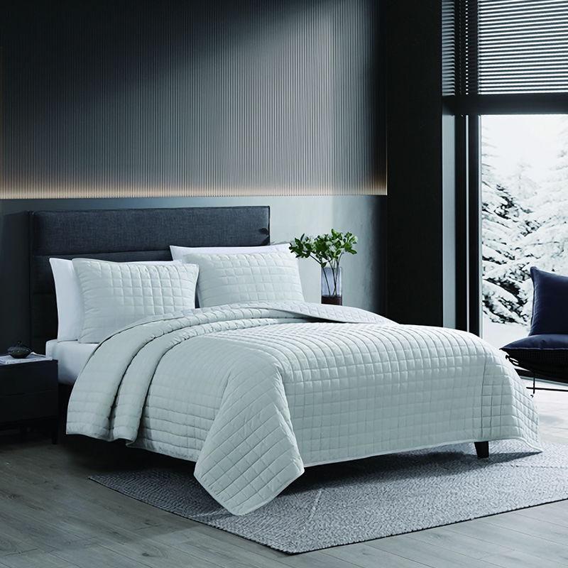
Makatuwiran ang pagpili ng neutral na base para sa bedding kung gusto ng isang tao na manatiling sariwa ang kuwarto habang lumilipas ang panahon. Ang mga kulay tulad ng ivory, taupe, o light gray ay lubos na gumagana dahil hindi ito nag-iiba sa anumang iba pang kulay. Karamihan sa mga tao ay nakakakita na ang mga batayang kulay na ito ay madali lang i-mix lalo na kapag sinusubukan nilang baguhin ang dekorasyon tuwing may pagbabago ng season o kapag idinaragdag ang mas matinding kulay mamaya. May isang konsepto na tinatawag na 60-30-10 ratio kung saan ang 60 porsiyento ay dapat neutral, 30 porsiyento naman ay ibang kulay, at ang huling 10 porsiyento ay para sa mga detalyeng nakakaakit ng pansin. Bagama't mukhang maganda ito sa teorya, hindi lahat ay sumusunod nang mahigpit sa mga numerong ito. Ang pinakamahalaga ay ang kakayahang palitan ang unan o ilagay ang bagong sining nang hindi kinakailangang itapon ang lahat ng nasa ilalim. Dahil dito, maraming tao ang bumibili ng kompletong set ng kama na may neutral na kumbinasyon muna. Oo, baka mas malaki ang gastos sa umpisa, pero para sa karamihan, sulit naman ang pagtitipid sa hinaharap kapag muli nilang binabago ang palamuti.
Paggamit ng kulay at tela ng bedding upang maipakita ang mood at tema
Ang mga kulay at tela na ginamit para sa kumot ay talagang nakakapagbigay ng mood sa isang silid. Ang mga makapal na kulay tulad ng berde esmeralda o malalim na asul na zafiro sa mga kumot na velvet ay nagbibigay ng isang mapagmataas na pakiramdam na nagpaparamdam sa anumang espasyo na parang mainit na tirahan. Sa kabilang dako, ang puting percale na mga kumot na cotton sa mga kulay ng kalangitan o pahid na sage ay nagdadala ng sariwa at malinis na aura na labis nating minamahal. Ang mga tinigilang tono na sobrang pinag-uusapan ngayon—tulad ng alikabok na rosas at mainit na oatmeal—ay karaniwang nagpaparamdam ng kalmado sa mga tao, na nagpapaliwanag kung bakit ito gumagana nang maayos sa mga silid na estilo ng Scandinavia na kitang-kita ang pagkahumaling ng marami sa kasalukuyan. Kung gusto ng isang tao na magbago ang karakter ng kanilang kuwarto sa loob ng isang araw, maaaring sulit na isaalang-alang ang mga duvet cover na dalawang tono. Magsimula sa isang maliwanag tulad ng kayumanggi sa umaga kapag mayroong sagana ang liwanag ng araw, at pagkatapos ay lumipat sa mas madilim na kulay uling habang bumaba ang gabi para sa isang sopistikadong itsura nang hindi kailangang baguhin ang lahat araw-araw.
Pagpili ng mga takip na kumot at kutson na tugma sa estetika ng kuwarto
Kapag pumipili ng mga texture ng kumot, isipin kung ano ang bagay sa arkitektura sa paligid nito. Ang mga rustic farmhouse na hitsura ay mahilig sa mga weave na linen, ang modernong espasyo ay pinakamainam na may makinis na sateen finish, at kung gusto ng sinuman ang klasikong pakiramdam, ang matelassé stitching ay nagdadagdag ng tamang antas ng charm mula sa sinaunang panahon. Kailangan din namang i-coordinate ang mga patterned na kutson sa naroroon na dekorasyon. Maaaring mukhang kaakit-akit ang isang kutson na may heometrikong tahi sa tabi ng mga window mullions, at ang mga floral print ay karaniwang magkakasundo sa botanical wall art. Ang mga neutral na kulay naman ay nangangailangan ng iba't ibang diskarte. Subukan ang paghahalo ng mga texture sa loob ng parehong palette. Ang mga takip na kutson na kulay bato na pinares kasama ang isang manipis na knit throw sa magkatulad na tono ay lumilikha ng lalim nang hindi sumasakop sa mata. Ang paraang ito ay lubos na epektibo kapag nais gawing komportable at sopistikado ang isang silid-tulugan nang sabay.
Mga Teknik sa Pag-uulos para sa Higaan na May Tiyak na Estilo
Mga hakbang-hakbang na pamamaraan sa pagtulid ng kama upang makamit ang lalim at kagandahan
Magsimula sa isang magandang fitted sheet upang manatiling maayos ang ilalim. Ilagay ang flat sheet nang nakaharap pababa upang makita ng lahat ang magandang gilid nito. Ayon sa ilang eksperto sa pagtutulid ng kama noong 2022, ang paglalagay ng magaan na coverlet o quilt ay nagdadagdag ng magandang texture nang hindi nagiging sobrang mainit. I-fold ang duvet sa tatlong bahagi sa dulo ng kama upang ipakita ang anumang kakaibang disenyo o materyales nito—isang bagay na lubos na inirerekomenda ng mga mamahaling tindahan ng linen. Tapusin ang ayos gamit ang dalawang karaniwang unan para matulog at idagdag ang dalawang Euro shams para sa taas at pansining interes. Nagbubuo ito ng balanseng hitsura na karaniwang nagugustuhan ng mga tao kapag pumasok sila sa kuwarto.
Paghahalo ng mga disenyo at texture sa higaan nang hindi labis na bumibigat sa espasyo
Kapag pinagsasama ang iba't ibang istilo ng kumot, subukang pagsamahin ang malalaking bulaklak na disenyo sa duvet kasama ang mas maliit na heometrikong hugis na unan para sa kaunting kontrast. Ang isang magandang pamantayan ay humigit-kumulang 7 bahagi ng solido telang tulad ng lino o sateen sa 3 bahagi ng may disenyo. Nakakatulong ito upang hindi mukhang labis na abala ang hitsura. Kunin ang ivory quilt na may texture bilang base layer sa ilalim ng navy stripe na duvet. Ang kombinasyong ito ay nagbibigay ng sapat na lalim nang hindi napapawi ang espasyo. Ilagay din ang isang talagang makukulay na may disenyo ng unan kahit saan. Ito ay nakakaakit ng atensyon kung saan kinakailangan nang hindi ginagawa ang lahat na kaguluhan.
Pagbabalanse ng pagiging simple at pagkakalayer upang mapanatili ang magkakaugnay na itsura
Limitahan ang mga nakikitang layer sa tatlong pangunahing bahagi: base sheet, mid-layer (blanket o coverlet), at statement piece (duvet o quilt). I-drape ang duvet nang di-simetriko upang ipakita ang mga nagtutugmang kulay mula sa mas mababang layer. Ang teknik na ito ay tinitiyak ang pagiging functional habang binibigyang-diin ang sinasadyang ugnayan ng kulay sa iyong set ng kumot.
Minimalist laban sa Maximalist na mga pamamaraan sa naka-koordinating kumot
Pagdating sa palamuti ng kuwarto, madalas na ginagamit ng minimalist ang iba't ibang texture ngunit nananatiling simple. Isipin mo ang manipis na matte cotton na kumot na nakapatong sa makintab na satin na unan na nagbibigay ng payak ngunit elegante ng hitsura na gusto ng karamihan. Sa kabilang dako, ang mga maximalist ay puno ng kulay at detalye. Maaaring maglagay sila ng klasikong buffalo check na quilt sa itaas ng maliwanag na bulaklak na kumot, at pagkatapos ay magtatabi ng kahit anim na dekorasyon na unan na may iba't ibang kulay at disenyo. Ayon sa ilang kamakailang pag-aaral noong nakaraang taon, humigit-kumulang 58 sa bawat 100 taong napanood ang tulog nang mas mahusay araw-araw sa mga minimalist na setup. Ngunit kapag may bisita o kailangan ng isang magandang suite sa hotel, ang masiglang anyo ng maximalist ang agad na nangingibabaw.
Pagpapaganda sa Kama gamit ang Unan, Shams, at Throws
Paggamit ng Magkapares na Unan at Shams upang I-angat ang Estilo ng Kama
Magsimula sa pagbuo ng hitsura ng iyong kama sa pamamagitan ng paglalagay ng mga malaking Euro shams nang patayo laban sa anumang headboard na meron ka. Ang mga 26-pulgadang parisukat ay pinakamainam dahil nabubuo ang matibay na base sa likod ng karaniwang unan para matulog at iba't ibang dekorasyong palamuti. Ngayon, inirerekomenda ng karamihan sa mga eksperto sa interior na ipila ang mas maliit na harapang shams na gawa sa magkatulad na kulay o tono ng duvet cover. Nililikha nito ang napakakinis na itsura na gusto ng lahat ngunit nagbibigay pa rin ng kalayaan na eksperimentuhin ang iba't ibang texture tulad ng magagarang border o may panahi-panahing detalye dito at doon. Isipin mo ito parang isang pree-made na bedding package ngunit may puwang para baguhin ayon sa anumang bagay na talagang magmumukhang maganda sa espasyo.
Paggamit ng Throws at Accent Pillows para sa Ginhawa at Kontrast
Ang paghagis ng makapal na knit o linen na kumot nang pahiyaw sa ibabaw ng kama ay nakatutulong upang ihalo ang mga masyadong perpektong hitsura gamit ang isang bagay na tila talagang ginamit. Ang malambot na sateen na takip ng unan ay mainam kapareha ng mga mas magaspang na boucle accent pillow na may tugmang kulay. Ginagawa na ng mga designer ang ganitong paghahalo ng texture sa loob ng ilang taon, ayon sa isang kamakailang pag-aaral ng uso noong 2023 kung saan halos dalawang ikatlo sa kanila ang nagsabi na regular silang gumagamit nito. Kapag itinatayo ang mga karagdagang kumot sa kama, pipiliin ang magkakatulad na mga shade tulad ng sage green na pares sa celadon na mga tono. Panatilihing magkakaayon ang itsura ngunit iwasan ang pagiging boring at paulit-ulit.
Paggamit ng Mga Unan at Tekstil sa Paglikha ng Dimension at Kagandahan
Abutin ang ganda at lalim na katulad ng hotel sa pamamagitan ng hinihirang estratehiya ng mga unan:
- Pangunahing layer: Dalawang Euro shams
- Gitnang antas: Mga standard shams na may 2" na mas malaking inserts para sa manipis na puno
-
Harapang antas: 18"x18" velvet o lumbar pillows
Ayon sa pananaliksik sa industriya, ang paggamit ng tatlong magkakaibang taas ay nagpapataas ng nadaramang kagandahan ng 41% kumpara sa patag na pagkakaayos.
Paggamit ng Accent Pillows at Shams sa Pagtukoy ng Mga Focal Point
Ilagay ang mga accent pillow na may makapal na disenyo o metallic na tapusin sa gitna ng kama upang mahikmahin ang paningin—ang rekomendadong 1:3 na rasyo ng mga statement piece sa mga solid ay nagpipigil sa labis na biswal na impresyon. Para sa mga bukas na konseptong kuwarto, i-coordinate ang tela ng sham sa mga naka-adyacenteng unan sa upuan upang lumikha ng sinasadyang mga linya ng paningin.
Mga Estratehiya sa Pagbubuklod ng Kulay para sa Isang Magkakaisang Hitsura ng Kuwarto
Paglikha ng Biswal na Atraksyon gamit ang Mapanuring Paggamit ng Kulay sa Pag-aayos ng Kama
Kapag pumipili ng mga kulay para sa kuwarto, magsimula sa mga bagay na ayaw pang maganda doon. Ang pagkuha ng isang set na 'bed in a bag' ay talagang matalino dahil karaniwang magkakatugma ang mga pirasong ito. Ang mga kumot, duvet cover, at unan—lahat ay karaniwang nagkakasama nang maayos kahit hindi mo na kailangang pag-isipan nang masyado. Halimbawa, ang mga pader na kulay sage ay maganda kapag pinalamanan ng mga kumot na may bahagyang berde o maaaring manatili sa mapusyaw na beige bilang ligtas na opsyon. Ayon sa Interior Design Association noong 2023, iminungkahi ng ilang pag-aaral na ang mga silid na may tugmang scheme ng kulay ay maaaring tumingkad nang humigit-kumulang 15% nang mas malaki. Kaya ang pag-iisip tungkol sa mga kulay ay hindi lang para magmukhang maganda kundi nakakaapekto rin sa pakiramdam ng sukat ng espasyo.
Paggamit ng Monokromatikong Scheme ng Kulay sa Mga Nauugnay na Set ng Higaan
Ang pagiging monochrome ay nagpapadali sa pagdekorasyon ngunit nagdadagdag pa rin ng interes na lalim sa kuwarto. Subukang ihalo ang iba't ibang tono sa loob ng isang grupo ng kulay, tulad ng mga kumot na abong-abo na may mas madilim na kulay uling na takip nang unan at marahil ay isang mas maputing abong komporter sa itaas. Ang buong itsura ay magkasama nang maayos nang hindi nagiging makitid o maaliwalas ang maliit na kuwarto. Isang kamakailang pag-aaral mula sa Material Flexibility noong 2024 ang nakatuklas ng isang kawili-wiling resulta - halos 8 sa bawa't 10 disenyo ang nagmumungkahi na magsimula sa monochrome na kumot kapag nagpoplanong palamutihan ang silid-tulugan. Ang simpleng ayos na ito ay mainam para sa pagbabago ng panahon dahil pinapayagan nito ang tao na magdagdag lamang ng mga kulay na accent sa susunod nang hindi kinakailangang baguhin ang lahat.
Paggamit ng Mga Komplementaryong at Kontrast na Accent para sa Dinamikong Estilo
Ang enerhiya sa disenyo ng kuwarto ay nagmumula sa matalinong mga kontrast. Isipin ang kulay navy blue na comforter na pinares sa mainit na kulay burnt orange na unan—ang mga kulay na ito ay nasa tapat-tapat sa color wheel at natural na nahuhuli ang atensyon kapag pinagsama. Kapag gusto mo naman ng mas hindi dramatiko, ang texture ay lubos na nakakatulong. Ang makinis na koton na kumot sa tabi ng mas magaspang na linen throw ay lumilikha ng kakaibang surface nang hindi umaasa lamang sa pagkakaiba ng kulay. Ayon sa mga kamakailang pag-aaral na inilathala ng Textile Trends noong nakaraang taon, ang mga kuwarto na may isang natatanging kontrasting item ay mas cohesive ang itsura kumpara sa mga kuwartong lahat ay perpektong nagmamatch—tunay na may apatnapung porsyentong pagpapabuti. Ngunit upang mapanatiling balanse ang hitsura, nakakatulong na ilagay ang mga vibrant na palamuti sa ibabaw ng mas simpleng neutral na base layer sa pagkakahiga.
FAQ
Ano ang 'bed in a bag'?
Ang 'bed in a bag' ay isang maginhawang set ng kumot na kasama ang lahat ng mga pangunahing piraso na kailangan mo para sa iyong kama, tulad ng mga kurtina, takip ng duvet, at takip ng unan. Ang mga set na ito ay dinisenyo upang magkapareho ang kulay at disenyo, na nagpapadali sa pagkamit ng magkakaugnay na hitsura nang hindi gumagasta ng maraming oras sa pagtutugma ng kulay o pattern.
Paano ko mapapakita ang biswal na pagkakaisa sa aking silid-tulugan gamit ang kumot?
Ang pagkamit ng biswal na pagkakaisa sa iyong silid-tulugan ay maaaring gawin sa pamamagitan ng pagpili ng mga tugmang kumot na magkasabay nang maayos sa tulong ng mga pattern, tekstura, at sukat. Inirerekomenda na magsimula sa isang pangunahing set at dahan-dahang magdagdag ng mga dekorasyong bagay na mayroon ng hindi bababa sa isang karaniwang elemento ng kulay.
Ano ang rasyo ng kulay na 60-30-10?
Ang patakaran ng kulay na 60-30-10 ay isang gabay para makamit ang balanseng distribusyon ng kulay sa isang silid. Ito ay nangangahulugang 60% ng isang nangingibabaw na kulay (karaniwang matatagpuan sa mga set ng kumot), 30% ng pangalawang kulay (tulad sa mga takip ng unan), at 10% para sa malakas na accent na mga piraso upang lumikha ng biswal na interes.
Bakit inirerekomenda ang mga neutral na tono para sa base ng kumot?
Inirerekomenda ang mga neutral na kulay, tulad ng ivory, taupe, o mapusyaw na gray, dahil nagbibigay ito ng kakayahang umangkop at madaling nakikisama kapag pinalitan ang dekorasyon tuwing may pagbabago ng panahon o idinagdag ang mas makukulay na piraso. Pinapayagan ka nitong baguhin ang hitsura mo nang hindi kailangang palitan ang lahat ng iba pang elemento sa silid.
Talaan ng mga Nilalaman
- Pag-unawa sa Nakaugnay na Bedding: Ang Batayan ng Isang Estilong Kuwarto
- Pagpili ng Tamang Base: Mga Neutral na Tono vs. Tematikong Disenyo
-
Mga Teknik sa Pag-uulos para sa Higaan na May Tiyak na Estilo
- Mga hakbang-hakbang na pamamaraan sa pagtulid ng kama upang makamit ang lalim at kagandahan
- Paghahalo ng mga disenyo at texture sa higaan nang hindi labis na bumibigat sa espasyo
- Pagbabalanse ng pagiging simple at pagkakalayer upang mapanatili ang magkakaugnay na itsura
- Minimalist laban sa Maximalist na mga pamamaraan sa naka-koordinating kumot
- Pagpapaganda sa Kama gamit ang Unan, Shams, at Throws
- Mga Estratehiya sa Pagbubuklod ng Kulay para sa Isang Magkakaisang Hitsura ng Kuwarto
- FAQ