বিছানাপত্রের সেট মিশ্রণের মৌলিক নীতিগুলি বোঝা
একটি বিছানাপত্রের সেটের গঠন কী এবং কেন অংশগুলি মিশ্রণ করা এখন ট্রেন্ড
সাধারণ বিছানার সেটে একটি ফিটেড শীট, ফ্ল্যাট শীট, ডাভেট কভার এবং সেই মিলে যাওয়া বালিশের কভারগুলি থাকে যেগুলি সবাই সবসময় ভুলে যায়। তবে Ruvanti-এর 2024 সালের বিছানার প্রবণতা সম্পর্কিত প্রতিবেদন অনুযায়ী, আজকের দিনে প্রায় 7 জনের মধ্যে 10 জন গৃহমালিক পুরো সেট কেনার চেয়ে নিজেদের মতো করে মিশ্রণ করে নেওয়াকে বেশি পছন্দ করেন। মানুষ এখন শুধু এমন কিছু চায় যা তাদের নিজস্ব মনে হয়। কেউ কেউ লিনেন এবং তুলা মিশ্রণ করে বিভিন্ন কাপড় একসাথে পছন্দ করেন, আবার কেউ কেউ উজ্জ্বল নকশাযুক্ত কমফোর্টারের সাথে সাদা রঙের শ্যামগুলি জুড়ে দেন। এটি সবকিছুই একটি ব্যক্তিগত স্বাদ প্রকাশ করে যা ঘরটিকে আসলে প্রতিনিধিত্ব করে, যা উৎপাদনকারীদের মতামতের উপর নির্ভর করে না।
সুসংহত বিছানা সাজানোর ক্ষেত্রে আকার, রং এবং টেক্সচারের ভূমিকা
কার্যকর মিশ্রণ তিনটি উপাদানের ভারসাম্যের উপর নির্ভর করে:
| ডিজাইন উপাদান | বিছানা সাজানোতে ভূমিকা | উদাহরণ মিশ্রণ |
|---|---|---|
| স্কেল | শ্রেণীবিন্যাস তৈরি করে | বড় ফুলের ডাভেট + ছোট জ্যামিতিক বালিশের কভার |
| রং | অমিল জিনিসগুলিকে ঐক্যবদ্ধ করে | নেভি শীট + স্লেট গ্রে থ্রো কম্বল |
| টেক্সচার | গভীরতা যোগ করে | ক্রিঙ্কেলড লিনেন শ্যামস + মসৃণ সাটেন বিছানার নীচের স্কার্ট |
60-30-10 অনুপাত মেনে চলুন: 60% প্রধান টেক্সচার/রং, 30% মাধ্যমিক, 10% আক্সেন্ট।
বিছানার জিনিসপত্র মিশ্রণ করার সময় এড়ানোর জন্য সাধারণ ভুলগুলি
- দ্বন্দ্বপূর্ণ ডিজাইন : দুটি বড় আকারের ছাপ (যেমন ড্যামাস্ক এবং পেইজলি) জোড়া লাগানো প্রায়শই চোখকে ভারী করে তোলে।
- থ্রেড কাউন্ট উপেক্ষা করা : 800TC সাটেন শীট এবং 200TC তুলা থ্রো মিশ্রণ করলে অসম পরিধান এবং আরামের স্তর তৈরি হয়।
- প্যালেটগুলি অতিরিক্ত জটিল করা : বিছানার সজ্জার জন্য প্রতি অবস্থায় 3টি মূল রঙ এবং 2টি টেক্সচারের মধ্যে সীমাবদ্ধ থাকুন।
- ঋতুভিত্তিক উপেক্ষা : গ্রীষ্মকালীন হালকা পার্কেল চাদরগুলি ভারী উলের কম্ফোর্টারের সাথে দৃশ্যমানভাবে মেলে না।
প্রফেশনাল টিপ: আপনার বিছানার ছবি 5 ফুট দূর থেকে তুলুন—যদি কোনও উপাদান অসম প্রাধান্য পায়, তবে তা সরিয়ে ফেলুন বা প্রতিস্থাপন করুন।
সমন্বিত রঙের প্যালেট ব্যবহার করে একটি ঐক্যবদ্ধ চেহারা তৈরি করা
বিছানার সজ্জায় নকশা এবং সলিডগুলি মিশ্রণের জন্য পরিপূরক নিরপেক্ষ রঙের ভিত্তি ব্যবহার করা
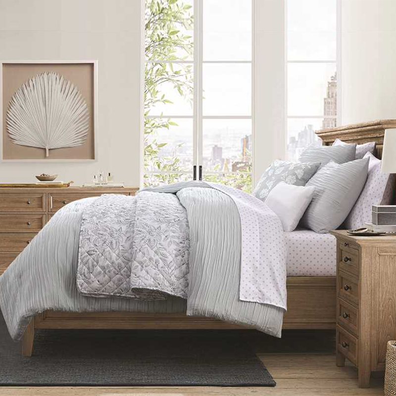
বিছানাপত্রের ব্যবস্থা করার সময়, বেজ, টোপ, অথবা নরম ধূসর রঙের মতো নিরপেক্ষ রঙ দিয়ে শুরু করা ভালো ফল দেয়। এই রঙের পছন্দগুলি বিভিন্ন ডিজাইন এবং একঘেয়ে আইটেমগুলি মিশ্রণের ক্ষেত্রে দুর্দান্ত নমনীয়তা প্রদান করে। গত বছর প্রকাশিত টেক্সটাইল ট্রেন্ডস রিপোর্ট-এর সদ্য প্রাপ্ত তথ্য অনুযায়ী, প্রায় চারজনের মধ্যে তিনজন অভ্যন্তরীণ ডিজাইনার মিশ্র বিছানাপত্রের ডিজাইন নিরপেক্ষ রঙের ভিত্তি দিয়ে শুরু করেন কারণ এটি দৃশ্যগত বিশৃঙ্খলা কমাতে সাহায্য করে এবং উজ্জ্বল সজ্জা আইটেমগুলিকে আরও স্পষ্টভাবে উজ্জ্বল করে তোলে। গাঢ় কয়লা রঙের কম্বলের নিচে ঝকঝকে সাদা চাদর ব্যবহার করুন, তারপর কিছু ডিজাইনযুক্ত বালিশের কভার যোগ করুন যা মিলে যায় কিন্তু খুব বেশি চোখে না পড়ে, যাতে জায়গাটিকে অতিরিক্ত ভারাক্রান্ত না করে যথেষ্ট দৃশ্যগত আকর্ষণ তৈরি হয়।
বিভিন্ন ডুভেট কভার, চাদর এবং শ্যামসকে ঐক্যবদ্ধ করতে কীভাবে একটি সামঞ্জস্যপূর্ণ রঙের প্যালেট ব্যবহার করবেন
ডিজাইনারদের যে 60-30-10 নিয়মটি বলে, সেটি অনুসরণ করার চেষ্টা করুন শয়নকক্ষের সজ্জা করতে। প্রায় 60 শতাংশ হওয়া উচিত নিরপেক্ষ রঙের ভিত্তি হিসাবে, আনুমানিক 30 শতাংশ হতে পারে দ্বিতীয় রঙের সন্নিবেশ, এবং মাত্র 10 শতাংশ থাকবে উজ্জ্বল আভা বা আকর্ষণীয় রঙের জন্য। ধাঁচের মধ্যে রাখার কৌশল হল বিভিন্ন জিনিসের মধ্যে দৃষ্টিগত সামঞ্জস্য তৈরি করা, কিন্তু সবকিছু যেন খুব বেশি মিলে না যায়। একটি সাদামাটা উদাহরণ দিয়ে শুরু করুন—একটি সেজ সবুজ কম্ফোর্টার রাখুন ক্রিম রঙের চাদরের উপরে যাতে সূক্ষ্ম সবুজ সূতা মিশ্রিত থাকে। কিছু ডেকোরেটিভ বালিশ যোগ করুন যাতে বড় পাতার নকশা থাকে এবং যা সবুজ ও ক্রিম উভয় উপাদানকেই ধারণ করে। আসলেই অভ্যন্তর ডিজাইনের পরীক্ষায় দেখা গেছে যে মানুষ এই ধরনের সমন্বয়কে প্রায় 62% সময় একসাথে ভালো দেখায় বলে মনে করে, এমনকি যদি পৃথক উপাদানগুলি সম্পূর্ণ আলাদা সংগ্রহ থেকে আসে। আসলে এটা যুক্তিযুক্ত, কারণ আমাদের মস্তিষ্ক রঙের সম্পর্কগুলি কতটা অবচেতনভাবে প্রক্রিয়া করে তা ভাবলেই বোঝা যায়।
বিভিন্ন সেট থেকে আকর্ষণীয় রঙ যুক্ত করা, তবুও দৃষ্টিগত বিশৃঙ্খলা তৈরি না করে
ঘরের মধ্যে আভূষণ হিসাবে শুধুমাত্র একটি বা দুটি উজ্জ্বল রঙ ব্যবহার করুন। ছোট ছোট স্পর্শই সবচেয়ে ভালো কাজ করে। উদাহরণস্বরূপ, গাঢ় নেভি রঙের একটি তাকিয়া আমাদের কাছে থাকা স্লেট নীল চাদরগুলি এবং অন্যত্র কেনা ডোরাকাটা তাকিয়ার কভারগুলির সাথে কীভাবে মিলিত হয়েছে তা ভাবুন। অতিরিক্ত না হয়ে বৈসাদৃশ্য খুঁজে পেতে, ইতিমধ্যে একাধিক জায়গায় উপস্থিত রঙগুলি বেছে নিন। ফুলের ছাপযুক্ত কম্ফোর্টারের ওপর থাকা টেরাকোটা দাগগুলি কীভাবে জ্যামিতিক আকৃতির কিছু বালিশের সাথে সুন্দরভাবে মিলিত হয়েছে তা বিবেচনা করুন। যাঁদের বিষয়ে ভালো ধারণা আছে তাঁদের অধিকাংশই বলেন যে এই আভূষণের রঙগুলির তীব্রতা একই রাখা গুরুত্বপূর্ণ। মৃদু হলুদ এবং উজ্জ্বল কমলা রঙ একসাথে মেশানো ঠিক মানায় না, কিন্তু মাসটার্ড এবং মাটির রঙের বাদামি রঙ সাধারণত ভালোভাবে মিশে যায়।
কেস স্টাডি: একক রঙের ভিত্তি এবং নকশাযুক্ত আভূষণ ব্যবহার করে পরিবর্তিত একটি শয়নকক্ষ
২০২৪ সালের একটি নবায়ন প্রকল্পে দেখানো হয়েছিল কীভাবে গ্রিজ ভিত্তি চারটি ভিন্ন বিছানার সেটকে ঐক্যবদ্ধ করেছিল। ডিজাইনার নিম্নলিখিত ব্যবহার করেছিলেন:
- হালকা গ্রিজ রঙের মসৃণ তুলোর চাদর
- মাঝারি তাওপে রঙের টেক্সচারযুক্ত লিনেন ডুভেট
- ধূসর, কয়লা এবং টেরাকোটা রঙের জ্যামিতিক শ্যাম
- একটি সমতাপূর্ণ ইকাট থ্রো তাকিয়া যা সমস্ত উপাদানকে একত্রিত করে
এই পদ্ধতিতে "মিসম্যাচ" হওয়ার চেহারা 81% কমেছে যখন দৃষ্টিগত গভীরতা বজায় রাখা হয়েছে, যা প্রমাণ করে একরঙা ডিজাইন দ্রুত আঁচল ও টেক্সচারের পার্থক্য ঘুচিয়ে দেয়।
বিছানার সেটগুলিতে আঁচল এবং টেক্সচারের ভারসাম্য রক্ষা
দৃষ্টিগত আকর্ষণের জন্য বিভিন্ন মুদ্রণের আকার (ছোট এবং বড় আঁচল) একত্রিত করা
ছোট ছোট নকশা এবং বড় ডিজাইনগুলি মিশ্রণ করলে জিনিসগুলিকে খুব ব্যস্ত না করেই আকর্ষণীয় বৈসাদৃশ্য তৈরি হয়। 2024 সালের একটি সদ্য প্রকাশিত টেক্সটাইল ডিজাইন রিপোর্ট অনুযায়ী, তাদের বিছানার সজ্জাকে ভারসাম্যপূর্ণ করতে চাইলে প্রায় দুই-তৃতীয়াংশ ডিজাইনার এমনটাই করে থাকেন। উদাহরণস্বরূপ, ক্ষুদ্র পলকা ডট যুক্ত চাদরগুলি জ্যামিতিক ছাপযুক্ত কম্বলের আবরণের মতো কিছু চোখে ধরা পড়ার মতো জিনিসের পাশে রাখা যেতে পারে। এখানে চাবিকাঠি হল এমন কমপক্ষে একটি রঙ ব্যবহার করা যা উভয় নকশাতেই উপস্থিত থাকবে, যাতে সবকিছু দৃষ্টিগতভাবে একত্রিত হয়। সঠিকভাবে করলে, এই পদ্ধতিটি বিছানায় দৃশ্যমান বিশৃঙ্খলা তৈরি না করে প্রাকৃতিকভাবে নির্দিষ্ট কিছু অঞ্চলের দিকে দৃষ্টি আকর্ষণ করতে সাহায্য করে।
ফুলের ছাপ এবং ডোরাকৃতি নকশা দিয়ে সহজ মিশ্রণ দিয়ে শুরু করা
নকশা মিশ্রণের ক্ষেত্রে, প্রমাণিত জোড়াগুলি দিয়ে শুরু করুন:
- ফুলের ছাপ + মৃদু ডোরা (যেমন, পাতলা ডোরাকৃতি চাদরযুক্ত গোলাপি ছাপযুক্ত তাকিয়ার ওয়াল)
- চেকড নকশা + জৈবিক আকৃতি (যেমন, পাতার সেলাইযুক্ত তাকিয়ার ওয়ালের সাথে টার্টান কম্বল)
সমসাময়িক অভ্যন্তর ডিজাইন নির্দেশিকা অনুযায়ী, আপনার বিছানার জিনিসপত্রের 60% কঠিন রঙ বা টেক্সচারে রাখুন যাতে জটিল ডিজাইনগুলি ভারসাম্যপূর্ণ হয়।
রঙ এবং স্কেল ব্যবহার করে বিভিন্ন কালেকশনের চাদর সেট এবং ডুভেট কভার জোড়া করা
এগুলি সারিবদ্ধ করুন:
| উপাদান | কৌশল |
|---|---|
| রঙের প্রাধান্য | ডুভেটের চেয়ে 1-2 শেড হালকা/গাঢ় চাদর বেছন |
| ডিজাইনের আকার | বড় ডুভেট ডিজাইনের সাথে ছোট চাদরের ছাপ ব্যবহার করুন |
| টেক্সচার বিপরীততা | লিনেন-এর মতো ডুভেটের সাথে মসৃণ সাটেন চাদর জোড়া করুন |
এমনকি আলাদা কালেকশনের বিছানার জিনিসপত্র একত্রিত করলেও এটি ঐক্য তৈরি করে।
গভীরতা পাওয়ার জন্য বিভিন্ন টেক্সচার এবং কাপড় স্তরে স্তরে বিছানার জিনিসপত্র সাজানো
কৌশলগত টেক্সচার মিশ্রণ স্পর্শে বিলাসিতা যোগ করে এবং দৃশ্যমান বিঘ্ন হ্রাস করে:
- বেস লেয়ার : স্পষ্ট তুলোর পার্কাল চাদর
- মধ্য স্তর : কোঁকড়ানো ম্যাটেলাসে আবরণ
- উপরের স্তর : মোটা বোনা থ্রো কম্বল
২০২৩ সালের বেডিং উপকরণ গবেষণায় উল্লেখ করা হয়েছে, ৩ বা তার বেশি টেক্সচার ব্যবহার করা বাড়িগুলিতে শোবার ঘরের আরামের সাথে ৪০% বেশি সন্তুষ্টি প্রতিবেদন করা হয়েছে।
যখন অতিরিক্ত প্যাটার্ন মিশ্রণ আরাম এবং ঐক্যতান কমিয়ে দেয়
বেডিং সর্বোচ্চ ২-৩ টি প্যাটার্নে সীমাবদ্ধ রাখুন, এবং সবসময় অন্তর্ভুক্ত করুন:
- একটি একরঙা উপাদান (যেমন, নিরপেক্ষ রঙের চাদর)
- একটি টেক্সচারযুক্ত উপাদান (যেমন, রিবড বালিশের কভার)
- একটি "শান্ত" প্যাটার্ন (যেমন, টোন-অন-টোন ডোরা)
এই সীমা অতিক্রম করলে প্রায়শই দৃষ্টি-ক্লান্তি দেখা দেয়, এবং স্লিপ ফাউন্ডেশনের একটি গবেষণায় জানা গেছে যে 74% অংশগ্রহণকারী খুব বেশি ডিজাইন করা বিছানার পরিবেশে ঘুমের মান খারাপ হয়েছে বলে জানিয়েছেন।
কৌশলগত স্তরায়নের মাধ্যমে ডিজাইনার ফিনিশ অর্জন
একাধিক বিছানার সামগ্রীর সেট থেকে আলাদা আলাদা জিনিস ব্যবহার করে ডিজাইনার চেহারা পাওয়ার জন্য স্তরায়ন কৌশল
বিভিন্ন সংগ্রহ থেকে চাদর, ডাভেট এবং কোয়িলট মিশ্রণ করে বিছানার সাজে গভীরতা যোগ করা হয়। ভিত্তি স্তরের জন্য কিছু সাদামাটা দিয়ে শুরু করুন—সাদা বা টোপে রঙের চাদরগুলি ভালো কাজ করতে পারে, কারণ এগুলি অন্যান্য বিছানার জিনিসের উজ্জ্বল ডিজাইনগুলিকে একসাথে ধরে রাখতে সাহায্য করে। 2023 সালের আন্তর্জাতিক ডিজাইন প্রবণতা সম্পর্কিত কিছু সদ্য গবেষণা অনুযায়ী, মানুষ তিন বা চারটি ভিন্ন টেক্সচারযুক্ত বিছানাকে প্রায় চল্লিশ শতাংশ বেশি ঐষ্ট্যময় মনে করে। বিছানার নীচের দিকে একটি হালকা লিনেন কোয়িলট কোণাকারভাবে ভাঁজ করে রাখার চেষ্টা করুন—এটি বিভিন্ন ধরনের কাপড়ের প্রদর্শন করে এবং দৃষ্টিতে ভারসাম্য রেখে খুব বেশি জটিল না করে তোলে।
মিশ্রিত ডিজাইনের সাথে মিল রেখে ফেলে দেওয়া তাকিয়া এবং কম্বল অন্তর্ভুক্ত করা
প্যাটার্নযুক্ত ফেলে দেওয়া তাকিয়াগুলি বিভিন্ন ডিজাইন উপাদানগুলিকে একত্রিত করতে খুব ভালো কাজ করে যা অন্যথায় সংঘাতপূর্ণ হতে পারে। একটি সংগ্রহ থেকে জ্যামিতিক আকৃতির তাকিয়ার কভারগুলি অন্য কোথাও থেকে ফুলের ছাপযুক্ত বিছানার চাদরগুলির সাথে মিশ্রিত করার চেষ্টা করুন, বিশেষ করে যদি তাদের মধ্যে একটি সাধারণ রঙের সূত্র থাকে। মাঝারি রঙের একটি ঘন বোনা কম্বল একইসাথে একাধিক প্যাটার্ন থাকলে রূপান্তরকে আরও মসৃণ করতে সত্যিই সাহায্য করতে পারে। বেশিরভাগ অভ্যন্তরীণ বিশেষজ্ঞরা প্রিন্টগুলি একত্রিত করার সময় মাত্র দুটি প্রধান আকারে আটকে থাকার পরামর্শ দেন। ছোট ছোট ডোটগুলি বড় পাতাযুক্ত প্যাটার্নের পাশে রাখলে একে অপরকে অতিমাত্রায় ঢেকে না দিয়ে খুব ভালো দেখায়।
সামঞ্জস্য এবং ভারসাম্য যোগ করতে বিভিন্ন সেট থেকে শ্যামস এবং ইউরো শ্যামস ব্যবহার করা
একই রঙের সুন্দর ইউরো শামগুলির পিছনে সাধারণ শাম রাখলে বিছানাটির আকৃতি আরও ভালোভাবে ফুটে ওঠে। যখন আমরা উপাদানগুলি মিশ্রিত করি, যেমন সাদা তুলোর শামের সাথে নরম ভেলভেট ইউরো শাম জুড়ে দেই, তখন এটি বিশৃঙ্খল না হয়ে আকর্ষক টেক্সচার তৈরি করে। কিছু অভ্যন্তর ডিজাইন বিশেষজ্ঞ উচ্চ-মানের শোবার ঘরগুলি নিয়ে গবেষণা করেছিলেন এবং একটি আকর্ষক বিষয় লক্ষ্য করেছিলেন: অধিকাংশ উচ্চ রেটিংযুক্ত ঘরে উচ্চতা একই থাকলেও শামগুলির কাপড়ের ধরন ভিন্ন ছিল। সেরা ফলাফলের জন্য, এমন শাম ব্যবহার করুন যাদের রঙের প্যালেট একই ধরনের। যেমন স্লেট নীলের সাথে সেজ সবুজ বা ডাস্টি গোলাপী এবং উষ্ণ গ্রেজ টোনগুলি মিলিয়ে দেখুন। এই পদ্ধতিতে বিভিন্ন বিছানার আনুষাঙ্গিক একসাথে সুসংগতভাবে কাজ করতে পারে, এমনকি যদি তারা আলাদা সংগ্রহ থেকে আসে।
বিভিন্ন সংগ্রহ থেকে ডুভেট কভার, চাদর এবং শাম একসাথে ব্যবহার করা
বিভিন্ন ডিজাইন বা রঙের ডুভেট কভার এবং চাদর কীভাবে সহজে জুড়ে ব্যবহার করবেন
একটি ভালো শুরু হল ধূসর, হাতির দাঁত অথবা এমনকি ওটমিল রঙের নিরপেক্ষ রঙের ডুভেট কভার। এগুলো তৈরির জন্য বেস লেয়ার হিসেবে দারুণ কাজ করে। চাদর যোগ করার সময়, পাতলা ডোরাকাটা বা ছোট জ্যামিতিক মোটিফের মতো সূক্ষ্ম নকশার শীট বেছে নিন যা ডুভেটের রঙের সাথে কমপক্ষে একটি রঙের সাথে মেলে। উদাহরণস্বরূপ, একটি সাধারণ বেলেপাথরের রঙের ডুভেটের সাথে জোড়া লাগানো টেরাকোটা ডোরাকাটা চাদর নিন, যা খুব বেশি চাপ না দিয়ে কিছুটা সুন্দর উষ্ণতা তৈরি করে। সাম্প্রতিক প্রবণতাগুলিও আকর্ষণীয় কিছু ঘটার ইঙ্গিত দেয়। লিনেন বিছানার উপর একটি সাম্প্রতিক প্রতিবেদনে দেখা গেছে যে আজকাল সমস্ত বিক্রির প্রায় 40 শতাংশ বিপরীতমুখী নকশা ব্যবহার করে যা বিভিন্ন উপাদানের মিশ্রণকে আগের তুলনায় অনেক সহজ করে তোলে। তবে জিনিসগুলিকে বিরক্তিকর দেখাতে বাধা দেওয়ার জন্য, প্যাটার্নগুলির আকার পরিবর্তন করতে ভুলবেন না। ডুভেটে বড় গাঢ় প্রিন্টগুলি সাধারণত চাদরে ছোট স্কেলের নকশার পাশে সবচেয়ে ভালো দেখায়।
বিভিন্ন সেট থেকে চাদর এবং বালিশের কভার মিশিয়ে একটি সুনির্বাচিত আবহ তৈরি করা
বিভিন্ন বিছানার সামগ্রীর সেটের মধ্যে অস্বস্তিকর জায়গাগুলি পূরণ করার সময় বালিশের কভারগুলি অতিরিক্ত আকর্ষণ হিসাবে খুব ভালো কাজ করে। যখন ডিজাইনযুক্ত চাদর নিয়ে কাজ করবেন, তখন সেই ডিজাইনে উপস্থিত রঙগুলির মধ্যে থেকে কোনও রঙের সাদা কভার বেছে নিন। একরঙা চাদর ব্যবহার করছেন? তাহলে সম্পূর্ণ ভিন্ন লাইন থেকে কিছু উদ্ভিদ-আধারিত ছাপ বা জ্যামিতিক ডিজাইন মিশিয়ে দেখুন। গত বছরের সদ্য প্রকাশিত গবেষণা অনুযায়ী, প্রায় দুই তৃতীয়াংশ পেশাদার ডিজাইনার এই পদ্ধতিটি আজকের দিনে মানুষের প্রিয় সেই 'বসবাসকৃত' চেহারা তৈরি করতে সাহায্য করে বলে মনে করেন। আবার টেক্সচার মিলিয়ে দেখার কথাও ভুলবেন না। বিছানার সামগ্রীর সেটের মধ্যে একই ধরনের থ্রেড কাউন্ট বজায় রাখুন, যেমন সবগুলোতে 400 থ্রেড কাউন্টের তুলোর মিশ্রণ বা এরকম কিছু, যাতে স্পর্শ করলে সবকিছু একত্রে সামঞ্জস্যপূর্ণ অনুভূত হয়।
প্রবণতা প্রতিবেদন: ডিজাইনার বিছানা যা উচ্চ-মানের এবং সাশ্রয়ী বিছানার সামগ্রীর সেটগুলিকে সফলভাবে মিশ্রণ করে
আজকাল শীর্ষ ইন্টেরিয়র ডিজাইনাররা বেলজিয়ান ফ্ল্যাক্স লিনেন ডাভেটের মতো উচ্চমানের জিনিসগুলি আরও সাশ্রয়ী মূল্যের চাদরগুলির সাথে মিশ্রণ করছেন, যা তাদের বিছানার বাজেটে 30 থেকে 40 শতাংশ পর্যন্ত সাশ্রয় করছে এবং তবুও অত্যন্ত আকর্ষক দেখাচ্ছে। সম্প্রতি টিকটকের একটি প্রবণতার কথা বিবেচনা করুন যেখানে কেউ 12 ডলারের একটি সস্তা ডোরাকাটা ফিটেড শীটকে 290 ডলারের একটি বিলাসবহুল লিনেন ডাভেট কভারের সাথে মিলিয়েছেন। তারা সবকিছু একসাথে গুছিয়ে তুলতে কিছু ওটমিল রঙের বালিশের কভার যোগ করেছিলেন এবং ধুম—সাধারণ মূল্যের একটি ছোট অংশেই তাৎক্ষণিক বিলাসবহুল আবহ তৈরি হয়েছে। এটা আসলে যুক্তিযুক্ত, কারণ মানুষ এখন এমন বিছানার সামগ্রী চায় যা তারা ইচ্ছামতো মিশ্রণ করতে পারবে। শিল্প প্রতিবেদন অনুযায়ী, 2026 সাল পর্যন্ত প্রতি বছর প্রায় 22% হারে এই ধরনের মডিউলার সিস্টেমের বাজার দ্রুত প্রসারিত হওয়ার প্রত্যাশা করা হচ্ছে। বুদ্ধিমানের মতো কেনাকাটা করলে খারাপ ফল নয়!
প্রায়শই জিজ্ঞাসিত প্রশ্ন - বিছানার সামগ্রী মিশ্রণ
প্রশ্ন: বিছানার সামগ্রী মিশ্রণ কেন জনপ্রিয় হয়ে উঠছে?
উত্তর: বিছানার সামগ্রীর টুকরোগুলি মিশ্রণ করে বাড়ির মালিকদের একটি অনন্য জায়গা তৈরি করার সুযোগ হয় যা তাদের ব্যক্তিগত শৈলীকে প্রতিফলিত করে, পূর্ব-কনফিগার করা সেটগুলির উপর নির্ভরশীলতা এড়িয়ে চলে যা তাদের স্বাদের সাথে সম্পূর্ণভাবে খাপ খাওয়াতে পারে না।
প্রশ্ন: বিভিন্ন বিছানার উপাদান মিশ্রণ করার সময় আমি কীভাবে একটি সামঞ্জস্যপূর্ণ চেহারা নিশ্চিত করতে পারি?
উত্তর: স্কেল, রঙ এবং টেক্সচারের ভারসাম্য রাখার উপর ফোকাস করুন। প্রধান, গৌণ এবং আভূষণ বৈশিষ্ট্যগুলির ভারসাম্য রাখতে 60-30-10 অনুপাত ব্যবহার করুন।
প্রশ্ন: বিছানার সেটগুলি মিশ্রণ করার সময় কোন সাধারণ ভুলগুলি এড়ানো উচিত?
উত্তর: সংঘাতপূর্ণ নকশা, অসামঞ্জস্যপূর্ণ থ্রেড কাউন্ট, অতিরিক্ত জটিল রঙের পরিকল্পনা এবং মৌসুমি বিছানার উপকরণগুলির উপযুক্ততা উপেক্ষা করা এড়িয়ে চলুন।
প্রশ্ন: বিশৃঙ্খলা না ঘটিয়ে আমি কীভাবে আভূষণ রঙ যুক্ত করার জন্য একটি ভালো কৌশল ব্যবহার করতে পারি?
উত্তর: বিদ্যমান বিছানার রঙের সাথে সামঞ্জস্য রেখে সুরের মাত্রা ঠিক রাখতে দুটি পর্যন্ত উজ্জ্বল আভূষণ রঙ ব্যবহার করুন।
প্রশ্ন: বিভিন্ন টেক্সচার আমার বিছানার ব্যবস্থাকে কীভাবে উন্নত করতে পারে?
উত্তর: বিভিন্ন টেক্সচার একত্রিত করা গভীরতা এবং স্পর্শগত আকর্ষণ যোগ করতে পারে, দৃশ্যমান বিশৃঙ্খলা কমিয়ে একটি আরও ঐশ্বর্যপূর্ণ অনুভূতির বিছানার দিকে নিয়ে যায়।
সূচিপত্র
- বিছানাপত্রের সেট মিশ্রণের মৌলিক নীতিগুলি বোঝা
-
সমন্বিত রঙের প্যালেট ব্যবহার করে একটি ঐক্যবদ্ধ চেহারা তৈরি করা
- বিছানার সজ্জায় নকশা এবং সলিডগুলি মিশ্রণের জন্য পরিপূরক নিরপেক্ষ রঙের ভিত্তি ব্যবহার করা
- বিভিন্ন ডুভেট কভার, চাদর এবং শ্যামসকে ঐক্যবদ্ধ করতে কীভাবে একটি সামঞ্জস্যপূর্ণ রঙের প্যালেট ব্যবহার করবেন
- বিভিন্ন সেট থেকে আকর্ষণীয় রঙ যুক্ত করা, তবুও দৃষ্টিগত বিশৃঙ্খলা তৈরি না করে
- কেস স্টাডি: একক রঙের ভিত্তি এবং নকশাযুক্ত আভূষণ ব্যবহার করে পরিবর্তিত একটি শয়নকক্ষ
-
বিছানার সেটগুলিতে আঁচল এবং টেক্সচারের ভারসাম্য রক্ষা
- দৃষ্টিগত আকর্ষণের জন্য বিভিন্ন মুদ্রণের আকার (ছোট এবং বড় আঁচল) একত্রিত করা
- ফুলের ছাপ এবং ডোরাকৃতি নকশা দিয়ে সহজ মিশ্রণ দিয়ে শুরু করা
- রঙ এবং স্কেল ব্যবহার করে বিভিন্ন কালেকশনের চাদর সেট এবং ডুভেট কভার জোড়া করা
- গভীরতা পাওয়ার জন্য বিভিন্ন টেক্সচার এবং কাপড় স্তরে স্তরে বিছানার জিনিসপত্র সাজানো
- যখন অতিরিক্ত প্যাটার্ন মিশ্রণ আরাম এবং ঐক্যতান কমিয়ে দেয়
- কৌশলগত স্তরায়নের মাধ্যমে ডিজাইনার ফিনিশ অর্জন
- বিভিন্ন সংগ্রহ থেকে ডুভেট কভার, চাদর এবং শাম একসাথে ব্যবহার করা
- প্রায়শই জিজ্ঞাসিত প্রশ্ন - বিছানার সামগ্রী মিশ্রণ